Today’s release is something that has been well over a year in the making… and honestly it is not even finished.
Between our two sites, www.uncannyxmen.net and www.mightyavengers.net, we attempt to release at least one feature a week, usually on a Thursday. A Spotlight, a Team Entry, a research article. On the other hand, it is very rare that we release a new site feature or major alteration for the site itself.
Today, however, we are proud to unveil a completely redesigned interface for our Cover Gallery.
For most of the two sites’ history, our Cover Gallery has been a bit of an embarrassment. It has been cumbersome to navigate, difficult to find what you want, has been woefully incomplete and not in a logical order. In short, it has been the least useful part of the site.
The revamped Cover Gallery page now operates much more similarly to the Issue Summary database. In fact, the two are partially integrated. More on that later, though.
When going to the new Cover Gallery landing page, you will see an alphabetical menu, just as you would see in the Issue Summary landing page.
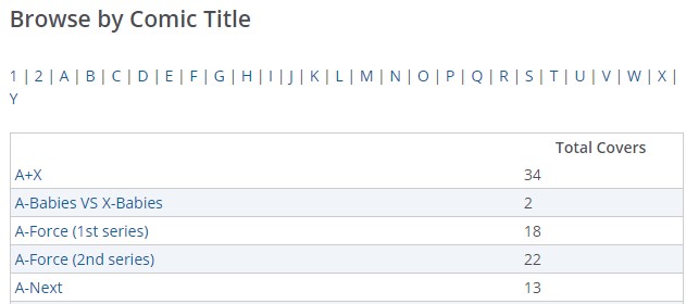
When you click on a comic Title, however, you will not initially go to that title’s cover gallery. Instead, you will be brought to a summary page that (for the moment), we are calling a Series Details. Here is what you would see looking at the title for A+X.
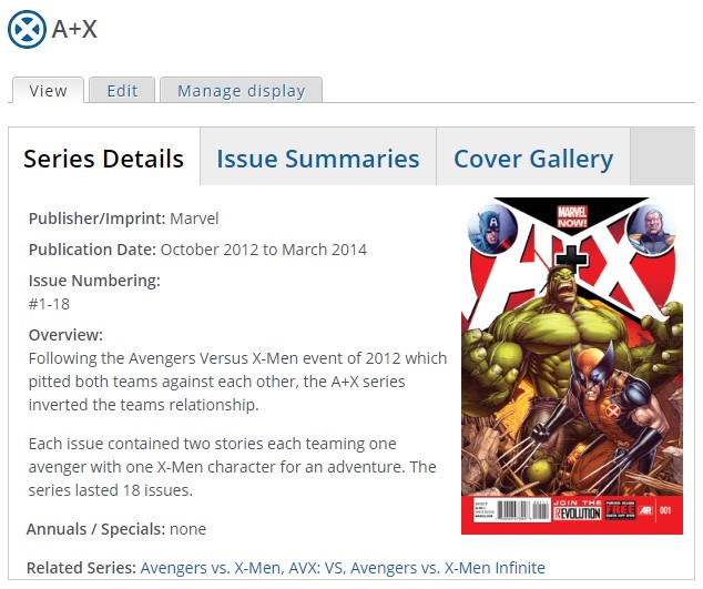
It is the goal of these Series Details pages to service for a title the way a Character Glossary entry serves for a character. There are numerous quick-info stats that show a title’s history and provide a quick reference to its place in Marvel’s publication history. At the bottom will be links to other comic titles that are directly related to that series. Additionally, there is a big cover of the series’ first issue cover for quick recognition.
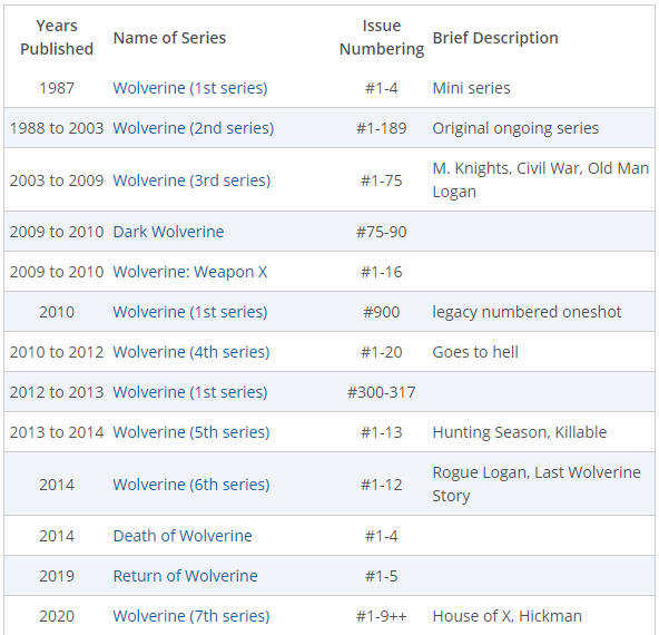
For some titles that are one of several (1st series, 2nd series, etc.), there will be a matrix, similar to what you would find in a Disambiguation article. These matrices will be far less comprehensive and will be limited to series with the same name, or one very similar. Here is an example from Wolverine.
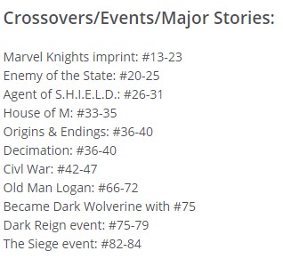
We are also experimenting with additional notes. Again, these will be quick reference material and will not be comprehensive. Admittedly, what goes into these fields will be subjective on our part. We like to think of ourselves as our own worst critics and err on the side of caution between what is useful and what is not.
At the top of each Comic Title’s page will be three tabs. The default tab will be the Series Details, as detailed above. The next two will be Issue Summaries and Cover Gallery, each of which takes a visitor to those respective pages. The Issue Summary tab/page will remain the same, though as note from there a visitor will have access to the other two tabs, effectively merging it with the cover gallery for that title.

Once in the Cover Gallery page, you will be able to see the respective covers, all in numerical order. Additionally, there is a radio button at the top regarding variant covers. The default view is “No Variants.” However, when the Include variant radio is selected, all variant covers will be displayed. The display is limited to 50 covers at a time, so series with a longer run will require you to navigate to the “next” page at the bottom.
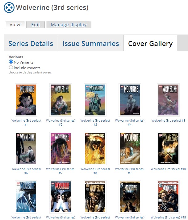
Regarding the covers themselves, over the last nine months, we have been slowly replacing old, manually scanned covers with more high-quality digital origin covers. We have limited the size of our covers to 400 pixels wide, only going larger for two-page or gatefold covers. There are larger, and more high-def versions of these covers out there on the internet. If one is interested in such copies, they are easily found. It is the purpose of the UXN and MAN sites to serve as resource and reference sites, and we try to keep this in mind when displaying the work of others.
As stated in the first paragraph, while we are unveiling this today, it is not finished. Due to the way these pages work from the admin side, the new information in the Series Details cannot be held back prior to release. With a Spotlight or an article, we work until the article is ready and only then publish. The article that is released is the finished product. Not so with the Series Details. As such, we could not begin to add more data without it being visible to our visitors. In the end, we decided to announce our changes, even as we have begun to make our changes.
Just as we have been working on the cover replacement for the last nine months, we will be working on updating the Series Details for all of our published Comic Titles over an even longer period of time. This process might take years. That being said, we think that the changes that already exist are pretty amazing and we hope that you, our visitors, enjoy the new format and find it useful.
Thanks much!
UXN / MAN staff
